Color plays an essential role in how we perceive brands and companies. Some colors inspire trust, and others curate excitement. Selecting the right colors for your luxury brand can determine if a customer feels neutral or enthusiastic about your brand.
In this post, I’ll cover the power of color psychology in branding for luxury brands. So you can attract the right customers and clientele to your brand and set the cadence of your business.
What is Color Psychology?
Color psychology is the study of how colors impact our emotions and behaviors. According to Web MD…
“Color psychology connects colors with emotions and behavior. It reveals how color plays a role in your moods. For businesses, color psychology informs decisions like product packaging and brand logos.”
When selecting colors for your brand, you’ll want to consider what specific colors mean to your audience. I advise you to select colors that make you happy as a brand owner and resonate with your ideal customers.
How Do Colors Affect How We Feel?
While there isn’t a lot of data on the impacts of color, some studies have been conducted to get a general idea about how people perceive specific colors.
According to the study titled Universal Patterns in Color-Emotion Associations Are Further Shaped by Linguistic and Geographic Proximity. People associate specific colors with certain emotions:
- Red: 68% associated red with love
- Blue: 35% linked blue to feelings of relief
- Green: 39% linked green to contentment
- Yellow: 52% felt that yellow means joy
- Purple: 25% reported they associated purple with pleasure
Awareness of what colors conjure up specific emotions will help you better understand how others perceive your luxury brand. Plus, ensure that your luxury brand attracts the right customers to your business.
Let’s better understand what specific colors mean emotionally for people.
The Meaning of Colors and How They Impact Your Luxury Brand
Now that we have a little history of how others perceive colors. Let’s look at what specific colors mean and represent to others.
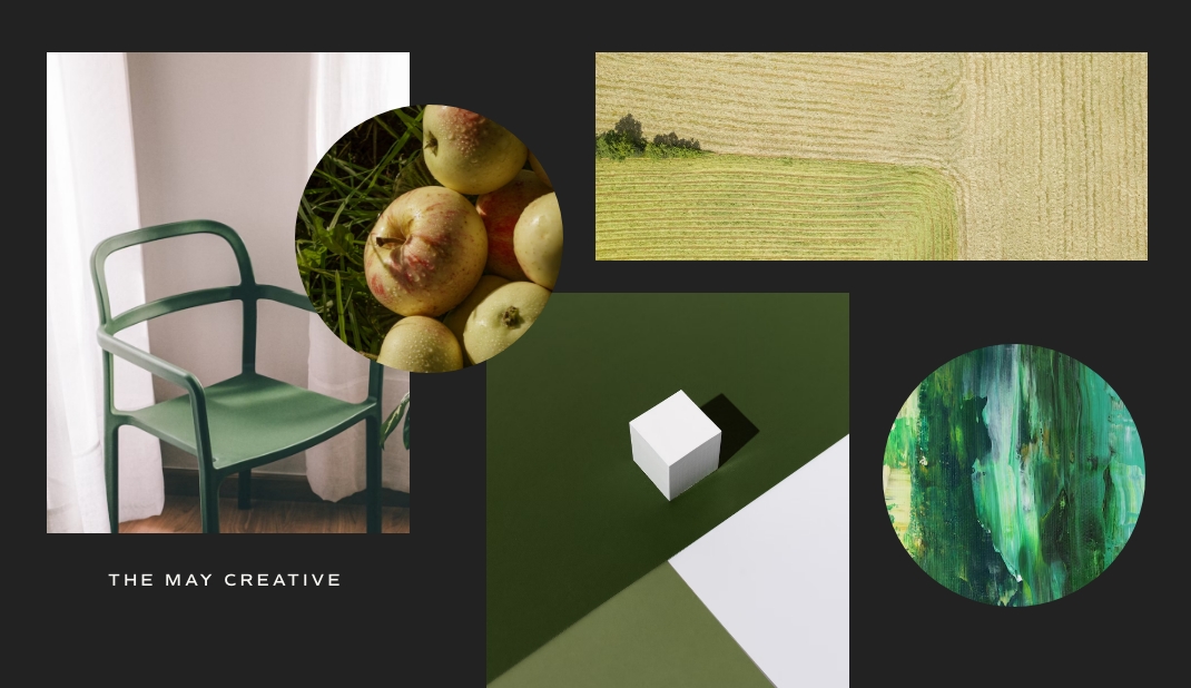
The Color Psychology of Green
The color green is often connected with calm and relaxation.
Along with a more earthy and natural vibe. The familiar words that people associate with green are
- Motivation
- Optimistic
- Envy
- Peace
Brands that use green in their branding are Starbucks, Land Rover, and Whole Foods.
Like all colors, green can be seen in various hues and spectrums, from a rich forest green to a more mellow pale green.
When considering using green in your luxury branding, think of what story you want the color to tell. Also, consider the types of products that you sell. Will they resonate with the familiar feelings people associate with the color green?
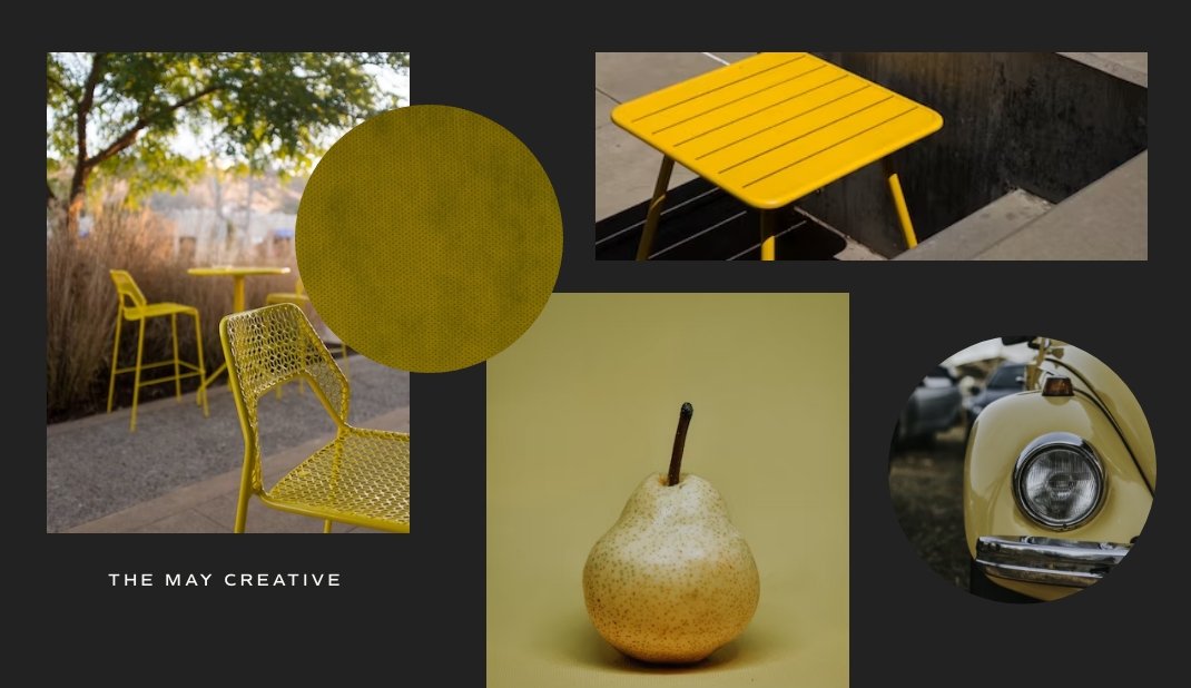
The Color Psychology of Yellow
The color yellow can represent happiness or be a warning depending on its use. Overall, most people associate the color yellow with joy or
- Energetic
- Bright
- Attention-grabbing
- Cheerful
Companies that use yellow in their branding are Pattern Beauty, Ferrari, and Nikon.
Tying your brand colors to how you want people to feel about your brand can result in a positive outcome.
Ferrari utilizes its brand colors very well. Their cars are attention-grabbing and most likely cause a slew of questions for the owners of these cars. Allowing the car owner to exude their desire for self-expression.
Curious to know what luxury consumers want? Check out What Do Luxury Customers Want Before They Buy.
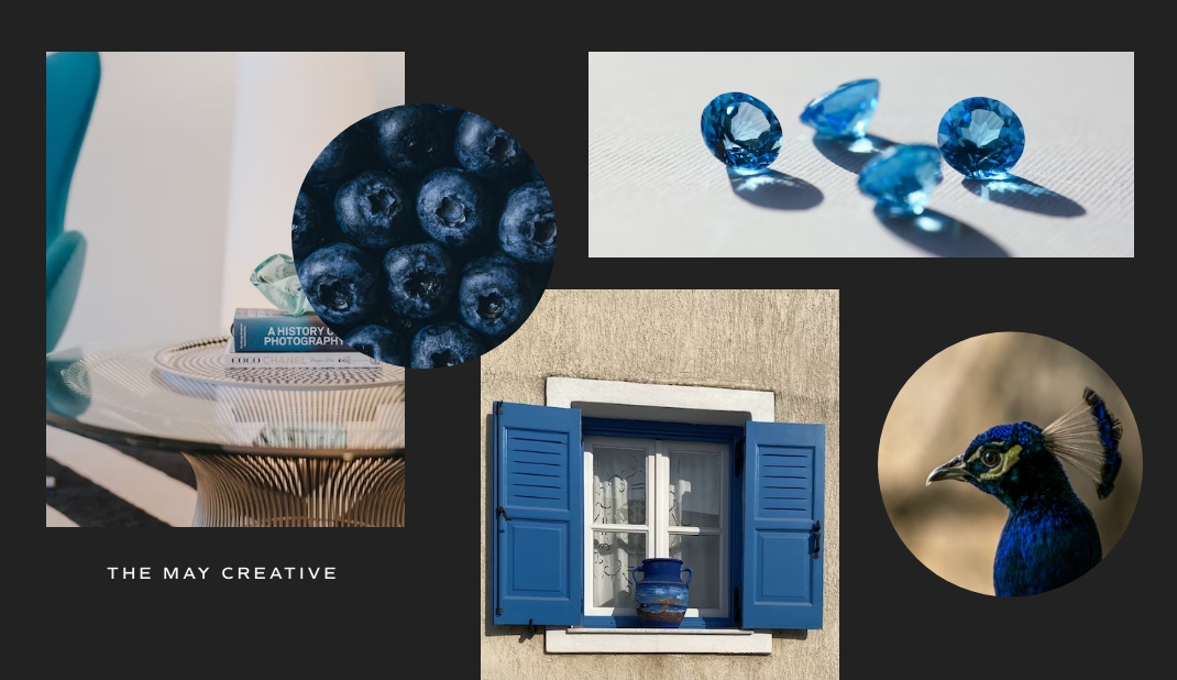
The Color Psychology of Blue
Blue is a common color used in many mass-market brands. Most people think of trust and reliability when they see the color blue.
Some brands that use blue in their branding are Tiffany & Co. and Boeing.
Words that often describe the thoughts & emotions of the color blue are
- Trustworthy
- Bravery
- Tranquility
- Responsibility
Tiffany & Co. is a trustworthy brand that has been around for years.
Other brands that people are comfortable with, especially in the U.S., are companies like Walmart, which target the mass market of customers.
The color blue is a versatile color that can be used in a variety of ways. Also, it can sometimes be a color that will blend your brand with other companies using this common color.
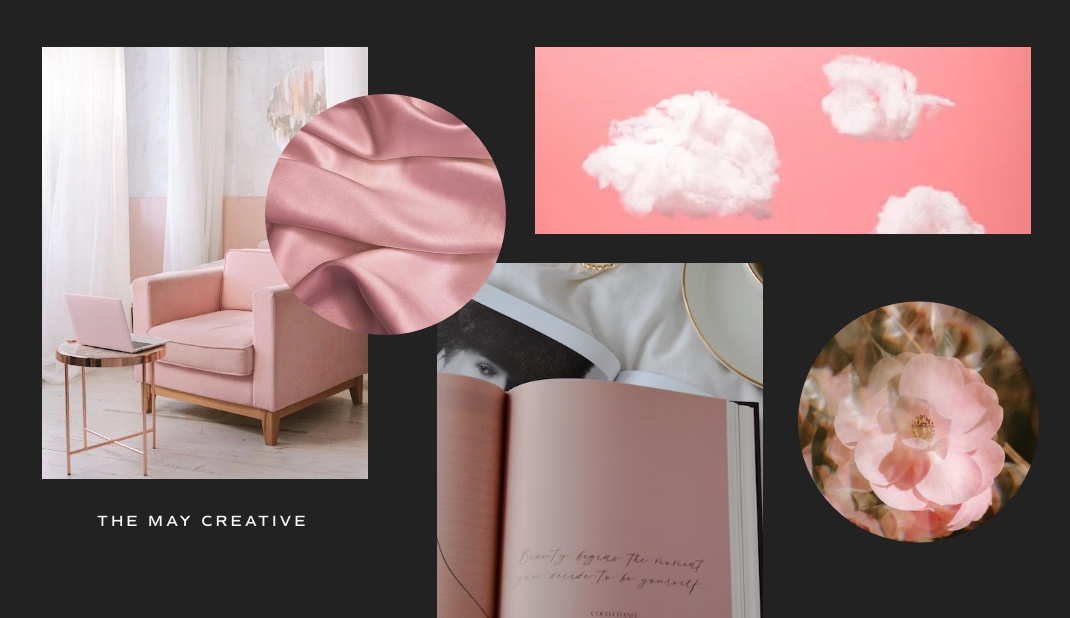
The Color Psychology of Pink
Pink can be seen in various ways. Its most often highlights romantic situations or more feminine products.
Some brands that use Pink in their branding are Victoria Secret, Benefit Cosmetics, and Barbie.
Words that often describe the thoughts & emotions of the color pink are
- Romance
- Kindness
- Feminity
- Playfulness
Do you have a product that will target more feminine energy or vibe? A hue of pink may be just what you need to stand out in your industry and attract the attention of your ideal customers.
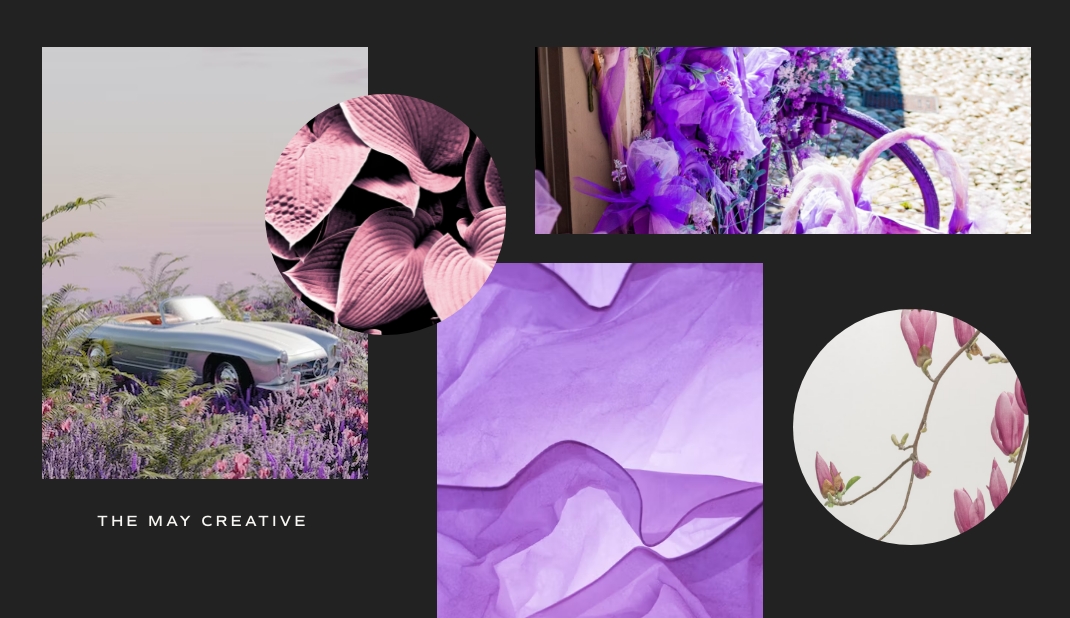
The Color Psychology of Purple
Purple is often associated with many thoughts and meanings. Its primary colors of blue and red make it a popular color that many people love.
Words that often describe purple are
- Mysterious
- Luxury
- Extravagant
- Independence
- Wealth
No wonder it’s such a popular color! Some companies that use purple in their branding are Tatcha, Purdy’s Chocolatier, and Aussie.
Sidenote: personally, I feel like I know a lot of people whose favorite color is purple. Is that the same for you? What’s your favorite color?
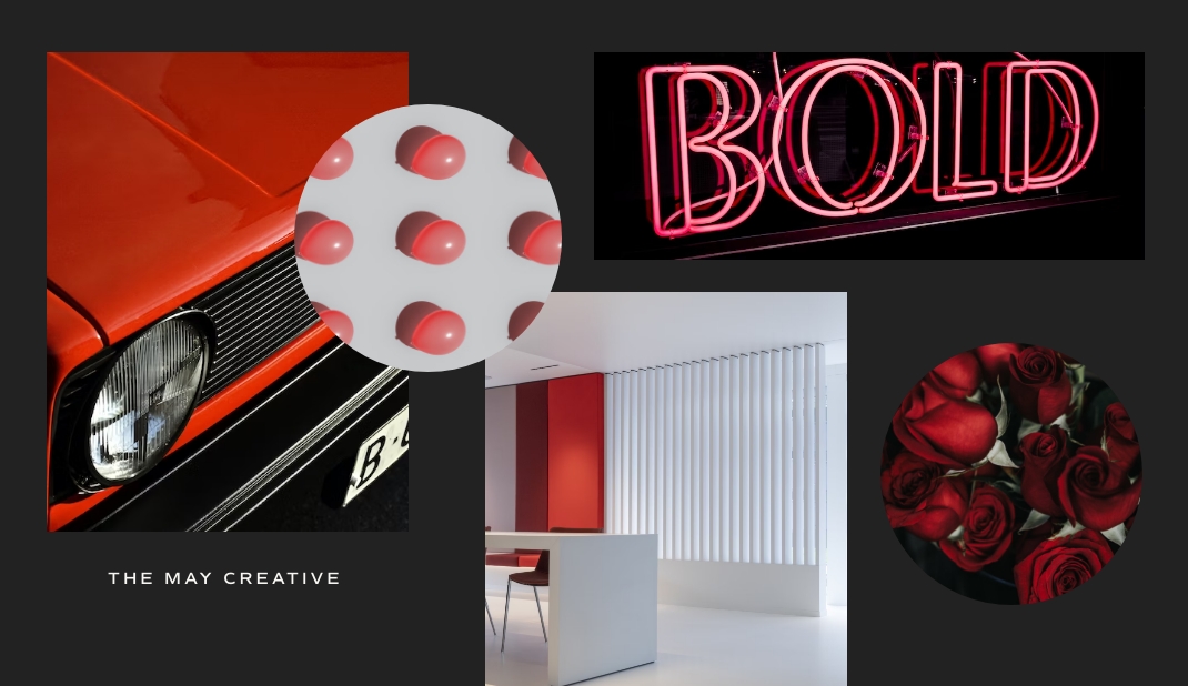
The Color Psychology of Red
Red is varied in that it can influence different emotions depending on the situation. From fiery passion to anger or pause.
As one of the boldest colors when applied to luxury, it can invoke words and feelings like
- Power
- Excitement
- Energy
- Romance
Popular brands with red branding are Netflix, Coca-Cola, and Canon.
Red is one of those colors you use when you want to be bold and make a statement. As a more daring color, it can be fun to use in packaging to help your products and packaging stand out amongst other brands.
Tip: if you are selling products in a highly-saturated market. Consider using the color red to help your brand and products stand out.
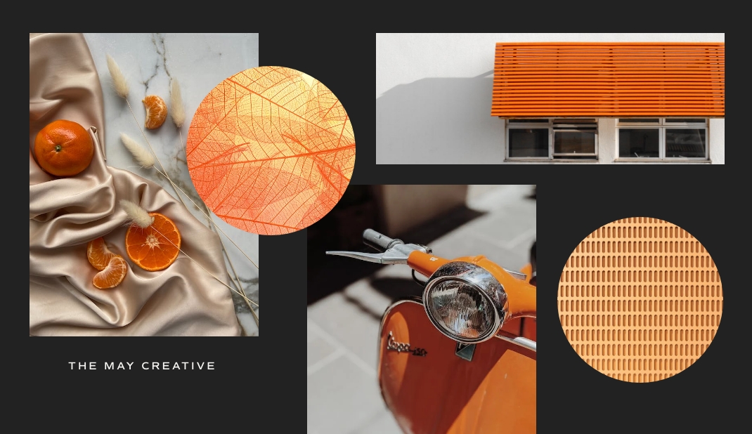
The Color Psychology of Orange
The color orange is a very happy and uplifting color. Depending on your region, the color could have different meanings, from negative to positive.
It’s important to research who will be your primary target audience and what region of the world they are located.
Words and feelings that often describe orange are
- Happy
- Energic
- Uplifting
- Fun
Brands that use orange in their branding are Hermès, Penguin Books, and Amazon.
Want to create some positive feelings and emotions with your products? Orange may be the perfect color for you to use. Companies that use the color orange typically have customers who associate them with a happy purchase.
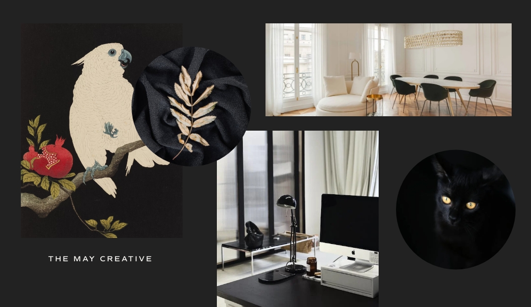
The Color Psychology of Black
Black is a neutral color with different meanings to people based on their experiences.
In terms of luxury branding, the color Black is often associated with
- Power
- Elegance
- Authority
- Sophistication
You’ll commonly see established luxury brands like Chanel, Gucci, Louis Vuitton, and others have black as a color in their brand.
This color is one of my favorites as its a great neutral color that is powerful yet elegant. It’s also a timeless color that can be used in various situations.
Also, I want to express that you aren’t obligated to use black in your branding as a luxury brand. I’ve had that asked plenty of times before.
Overall, the colors you choose to use in your business’s branding must be selected with your customers in mind. It shouldn’t be solely chosen because it’s your favorite color. In reality, you may not be your ideal customer.
It’s important to take the time to do proper market research before deciding which colors will work best for your brand. Market research is done during your product development and luxury brand strategy phase.
Taking the necessary time to work on this part of your business will save you so much in resources, such as time, energy, and money. Please do not skip this step regardless of your stage of business.
Want to elevate your luxury brand and website experience? Be sure to download the complimentary guide on 7 Facets to a Successful Luxury Brand and Website Experience.
